Community
for global innovation
Case Study
A non-profit website with a focus on connecting international students with employers who are willing to hire foreign nationals. Through the organization students are able to apply for financial assistance, join an online community, and volunteer to gain work experience.
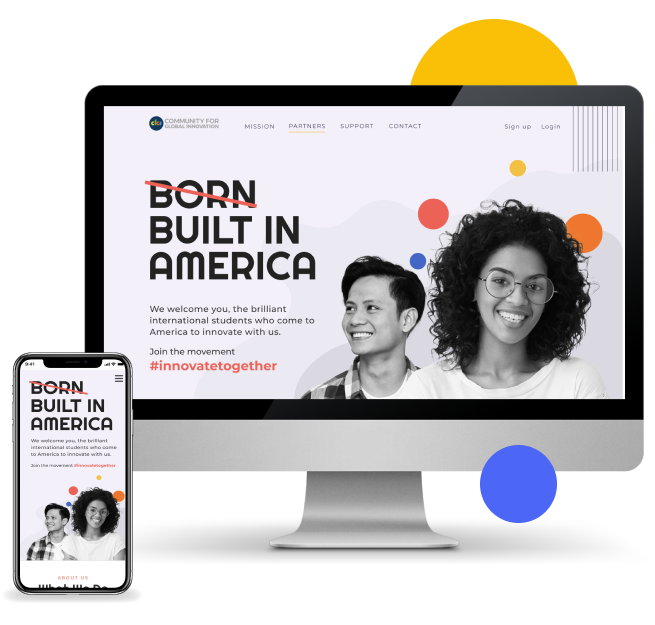
-Web redesign for a non-profit organization-
My role: Research, Sketching, User interface design, and Visual Design, Style guide and mood board, Information Architecture, Interaction Design, Photography, Photo Editing, Presentation Design
Tools: Miro, INvision, Figma, Trello, Abobe Photoshop, and Illustrator
Overview of case study
Problem
no. 1
International students have a high level of anxiety about finding a job
no. 2
They feel a great deal of stress trying to understand which companies are willing to potentially sponsor international students.
During our interviews and survey research, we discovered that most international students suffer a great deal of anxiety around securing a job after they graduate & sustaining finances to first-paycheck.
Therefore, we believe creating a community that easily connects international students and prosperous employers will mitigate potential stress.
Solution
A non-profit website with a focus on connecting international students with employers that hire foreign nationals. Through the organization students are able to apply for financial assistance, join an online community, or volunteer to gain work experience.
Research
The objective of the research was to discover areas of study, how they look for employment, and what are the biggest stressors. Here is what we discovered:
Interview summary:
5 out of 6
4 out of 6
Users were familiar with the hiring and immigration process
66%
Users felt pressure and stress associated with timing and immigration status
50%
Look for jobs online,
LinkedIn, Indeed, etc.
Masters Degree
Surveys summary

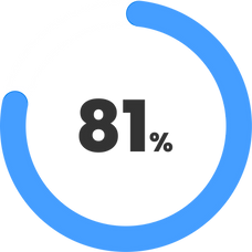
Majoring in
computer science
Pursuing or have a master degree
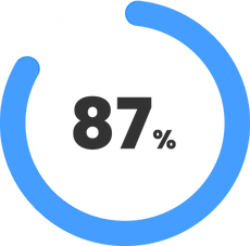
Experience difficulty finding a job because of their immigration status
User Insights :

NEMO URICH
Physics
“The amount of time spent trying to understand each regulation loophole. I might as well have become an immigration lawyer”

PARI DUPAR
UX designer
“You are automatically discarded in a lot of jobs if you have F1/OPT”

SISI CHEN
Fashion
“If there was only a way to search to see if companies are hiring international people”

URI SIMON
Economy
Sometimes there are job postings for the position but in reality, it has been offered to somebody else.
Existing Website Usability Testing
As CFGI organization is relatively new and current information on the website is scarce we wanted to uncover if current users are able to find the information they were looking for?
*Objective*
Does the website offer a clear message of who CFGI is and what services/product it is offering? Are users able to discover how CFGI can help them?
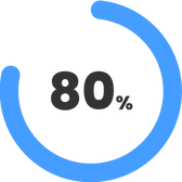
Unable to explain who would “Sponsor” or explain the mission of the non-profit is.
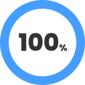
Users were unable to uncover what it means to “Take the Pledge” or in what ways they can volunteer.
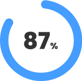
Testers were able to find and fill out the form for each category easily.

Users were unable to tell who would “Share their Story”.
Definition
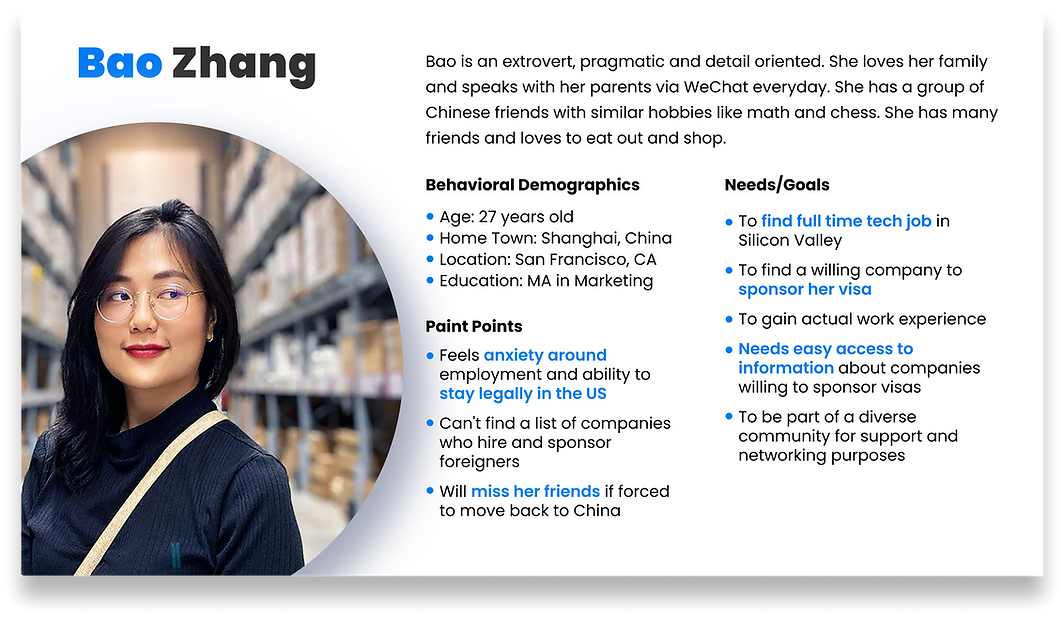
After conducting interviews we began analyzing user data and started to create an affinity diagram. We synthesized data and noticed a couple of main patterns emerging. In order to go deeper into the psychology, needs, and pain points of users we created Bao our user persona to help put a name, face, and a backstory for all our potential users. By doing so, it helped us better empathize with our users and understand the user’s goals, behaviors, needs, and how they would interact with the website.
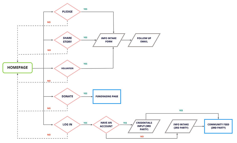
User Flow
Creating user flows helped us understand each step the users are going to take throughout this website. Based on our gained insight above and the services currently offered we created a user workflow.
These user flows helped us visualize a user’s path and also assist with building out the wireframes.
.jpg)
03. Ideation
At this stage, we started discovering that majority of our work will focus on content strategy and copywriting. We also needed to make sure that the website has an easy to scan layout and clearly explains the company’s mission and services offered.
Competitor analysis:
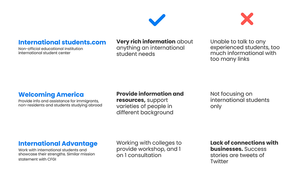
We began to ideate potential solutions using the "What if, I like, I wish" method. We synthesized ideas down to 4 key solutions using a feature prioritization matrix which helped us understand what users urgently need and prioritize what to build. To visually predict and explore a user’s experience with the website we created sketches.
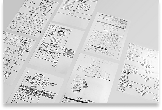
Initial Sketches
Taking into consideration our user research, initial testing, stakeholders insights, and competitive analysis, we sketched out some ideas and thoughts about what a redesign of the website might look like.
Next steps
-
Content strategy
-
Write clear copy, focus on vocabulary most ESL users can understand
-
Perform card sorting exercise with users to determine how to prioritize the content
04. Prototyping and Testing
After writing a copy we created the low-fi prototype. We incorporated micro-interactions and modal windows. Since our users successfully used the multipurpose information intake form on the existing site, we decided to keep one form for all sing ups. We replaced checkboxes and made the form dynamic, by generating different input fields depending on the selected topic from a dropdown.
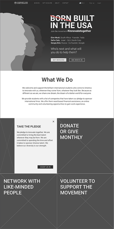
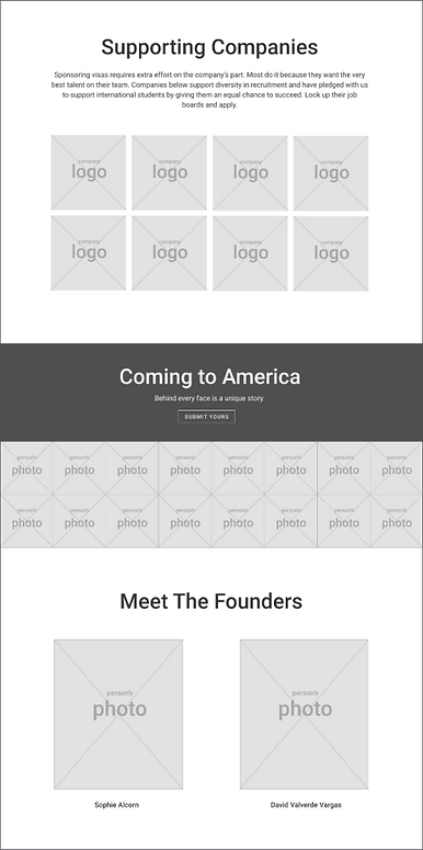
Low-fi prototype testing results
After testing the lo-fi prototype, we discovered that we needed to use more clear and easy-to-understand words as for the majority of users English is their second language. Additionally, after the card sorting with potential users, we discover they preferred a different order of the content in comparison to what we originally assumed.
Copy Iterations
What We Do:
Users wanted a clearer mission statement about CFGI. They read through the first paragraph but tend to skip the second one. We replaced an inspirational copy in the first paragraph with whom the services are for. We also clarified that the organization is a non-profit.

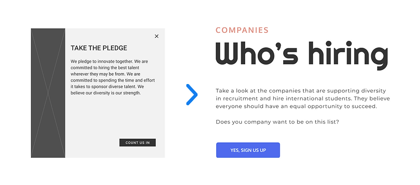
Take The Pledge:
“I had to look up the word ‘pledge’ in the dictionary” -user insight. Overall word “pledge” was problematic and unfamiliar to most users. We decided to rephrase the section and eliminate the word “pledge” completely.
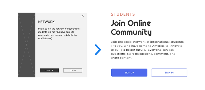
Online Community:
Word “Network” was very confusing. Users thought it was for user meetups and potentional enployment.
Visual Design
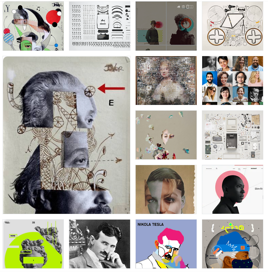
Moodboard
We focused on users with a goal to convey the nonprofit's mission. Our guiding principle was inspired Aristotle’s quote “The whole is greater than the sum of its parts.” We were looking at pictures that depict the mood of overlapping, interweaving and connecting seemingly unrelated parts into a unified whole. Because the structural fabric of the US is woven from devised people who moved from far and wide in order to pursue their dreams and if fortunate enough make them a reality.
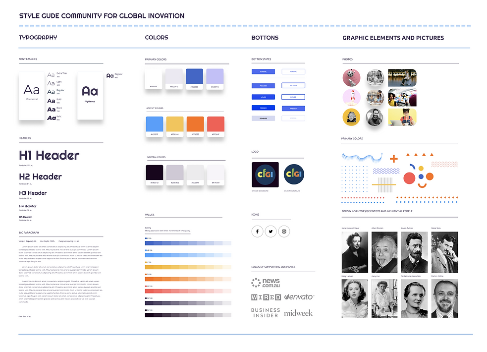
Style guide
We decided to go for upbeat and vibrant colors. Our main color scheme is Blue, Yellow-Orange, and Violet. When choosing colors we were relying on color symbolism and associations they carry. Blue is associated with the workforce, yellow-orange is the color of education and violet is the color of imagination and dreams.
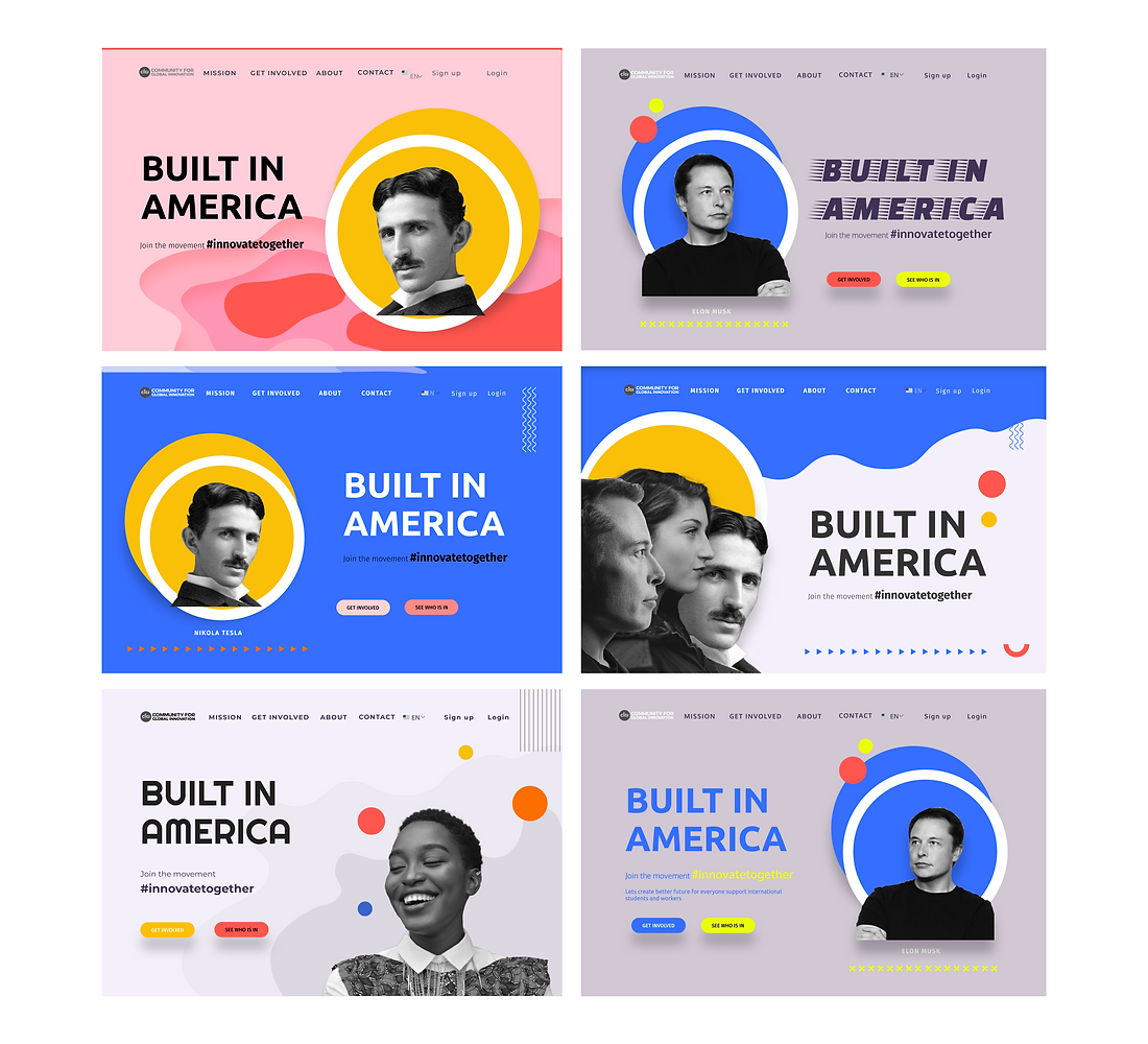
Design Brainstorm
Having in mind our user persona and stakeholders we wanted to create something that will satisfy everybody's needs and tastes. Giving that our non-profit is new we wanted to create a memorable design that will speak to its audience. We developed a few possible solutions and discussed each option and direction carefully.
Hero image
When picking imagery we wanted to represent international students. The final pick needed to exude youth, hope, vision, and target Silicon Valley demographic.

HI-FI prototype
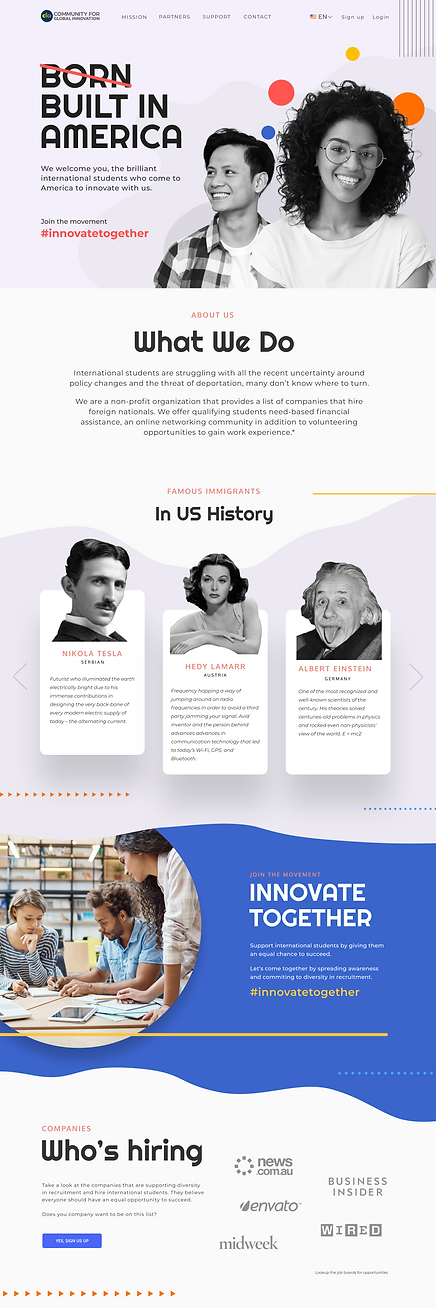
After lo-fi prototype testing and work on our visual design, we began the creation of our hi-fidelity prototype. At this stage, we created a mobile version of the website, improved the copy, added modules, and reprioritized the order of content (following card sorting results), added some fun micro-interactions.
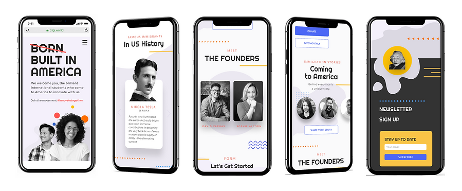
Hero page conveying mood of diversity and happines
The main mission of the non-profit organization
Famous immigrants in USA history with summarized achievements
Short description of the movement

List of the companies who are supporting the non-profit organization and who are willing to give equal chance to international students
We decided to make the 4 core initiatives static on the page.
International students stories
Flip cards with a short introduction about founders of non profit and their drive behind the organization
Micro-interaction with Ainsthain's picture
Multi-purpose form to stay in contact or apply for the volunteering opportunity with the organization
Testing
Testing is the final stage of the design thinking model. This stage is iterative. First, we focused on testing the existing website with users. We wanted to learn if they’re able to achieve the key goals that the website was designed for. After getting the initial data we produced an MVP and tested it. We synthesized data, redesigned it, and tested it again.
Low-fi prototype usability test:
-
The company’s mission needed more direct content Words “Network” and “Pledge” needed to be replaced
-
Users hovered over services cards hesitant to click on it
-
Users want more information on ways they can volunteer After card sorting, we need to change module order and add the “Famous Immigrants in US History” section
-
Make the movement campaign more prominent
-
“Submit Your Story” button gets lost
Hi-fi desktop and mobile prototype guerrilla test :
-
The hashtag #innovatetogether is not very clear what it’s for
-
Need more information about how the funds are distributed
-
Would like to see testimonials from students whom CFGI helped
-
Use the correct term “foreign nationals” vs “internationals”
Other Proposed Solutions
Besides redesigning the website we still wanted to help our stakeholders by figuring out how to easily raise money and gather everyone online. We looked into several solutions and came up with these 3rd party, easy roll-out, affordable platforms:

Fully customizable online community platform powered by modern social features, widgets, and native app store. This would help sociality the website, create an online community where users can support each other and form groups. We could leverage the platform to manage non-profit volunteer groups and job boards.

Fundraising & donor management software. No contracts. With Kindful, third-party tools seamlessly integrate with databases, keeping all information in one place.
Reflections
We found the majority of international students we interviewed are stressed about their immigration status. It was very interesting to learn about the hurdles they have to face in order to navigate through the system. Many of them are brilliant people who built their lives in the US and dream of building their future here. We were happy to see that we were able to work on a project that can support their future in America. Our team was so touched by the dedication of the founders. We’re committed to supporting the organization moving forward.
Takeaways
When building the website it is really important not to have assumptions about user's preferences rather to do tests often and every step of the way sometimes the most outlandish idea is what users really want.
The CFGI founders decided to implement and code the design we’re proposed. We completed the handoff process with their developers and offered continuous support moving forward. In the future, we would like to do more testing and expand the website with more content. Also we would like to build out the movement campaign and work on expanding the online community.